Brand
Sushi Kuma | Logo Redesign
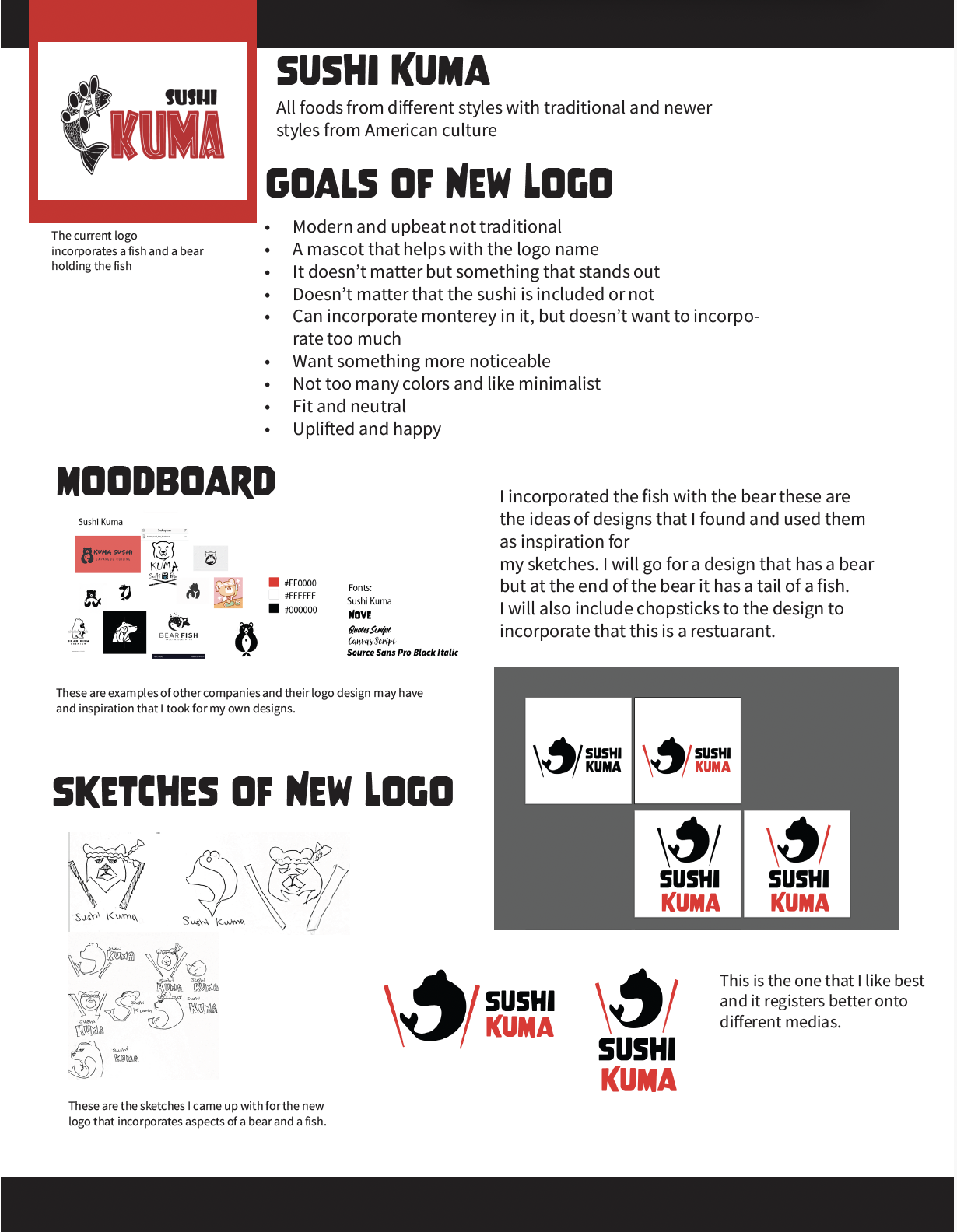
Overview
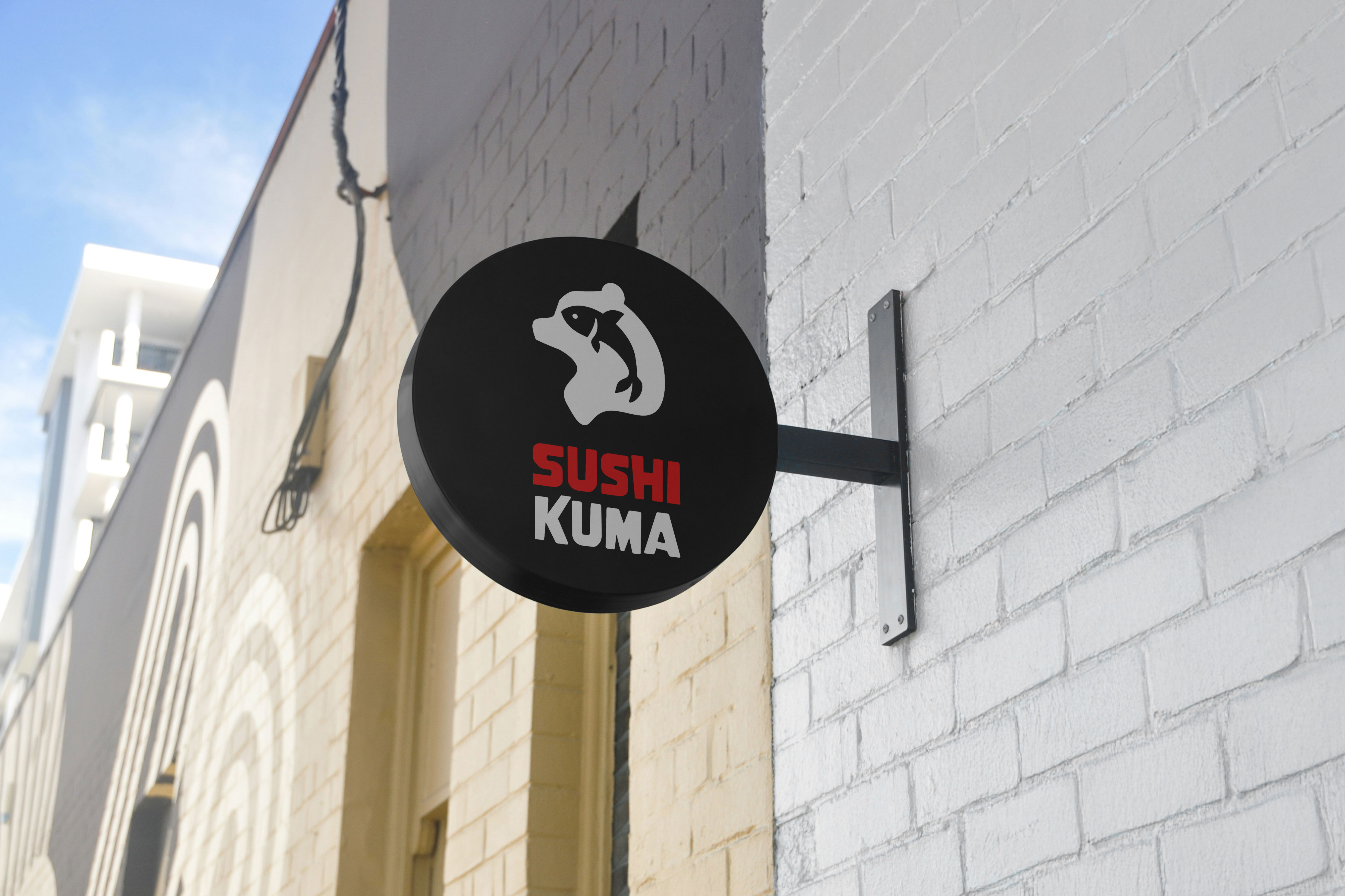
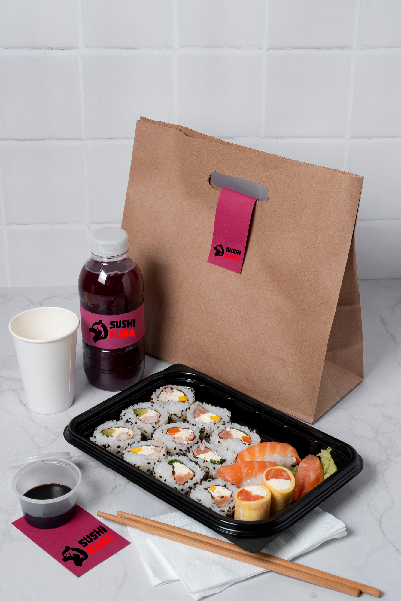
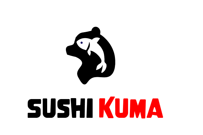
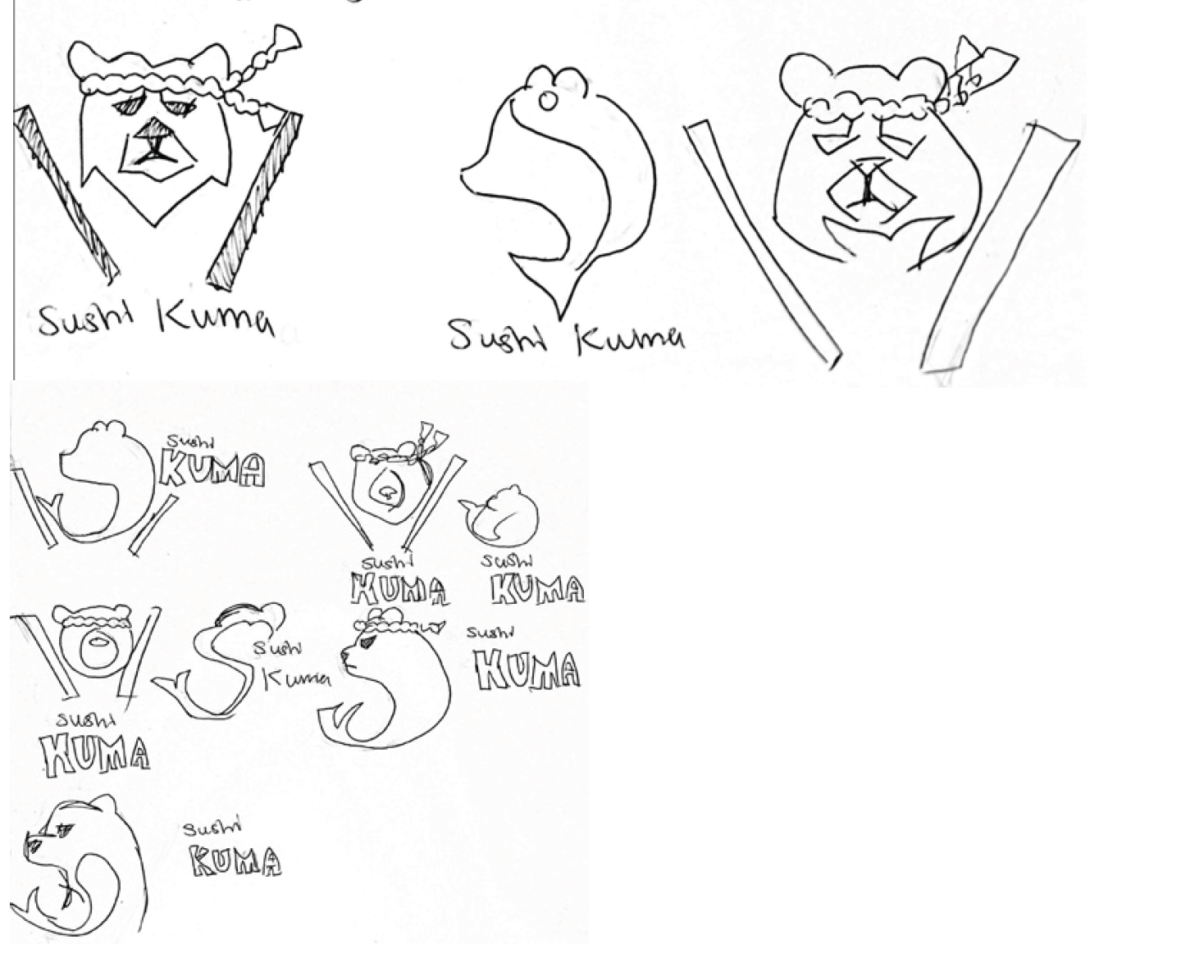
Modernized the Sushi Kuma logo through multiple iterations, emphasizing the bear element to better reflect the brand, as "Kuma" means bear in Japanese and including a fish graphic to represent the ocean.
Logo
Redesigned the Sushi Kuma logo to create a cleaner, more modern look by emphasizing the bear while integrating the fish into the overall design.
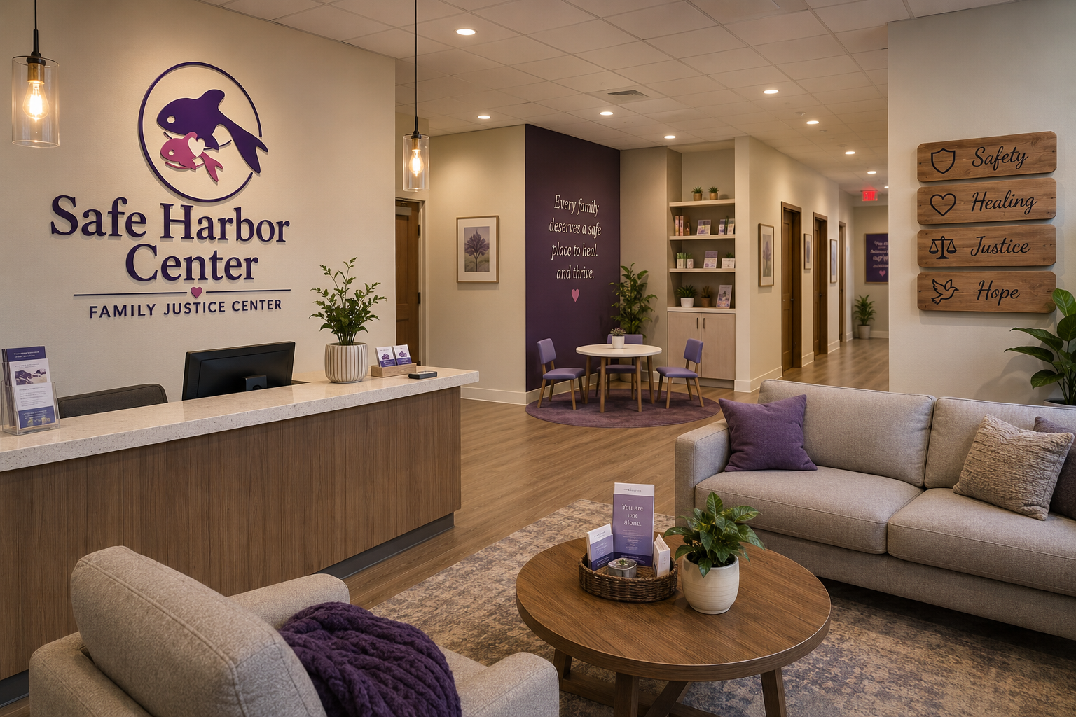
Safe Harbor Center Family Justice Center | Logo Design
Overview
Created a logo for a Family Justice Center in Salinas, CA, incorporating ocean-inspired elements and orcas to reflect Monterey Bay and symbolize unity, support, and community.
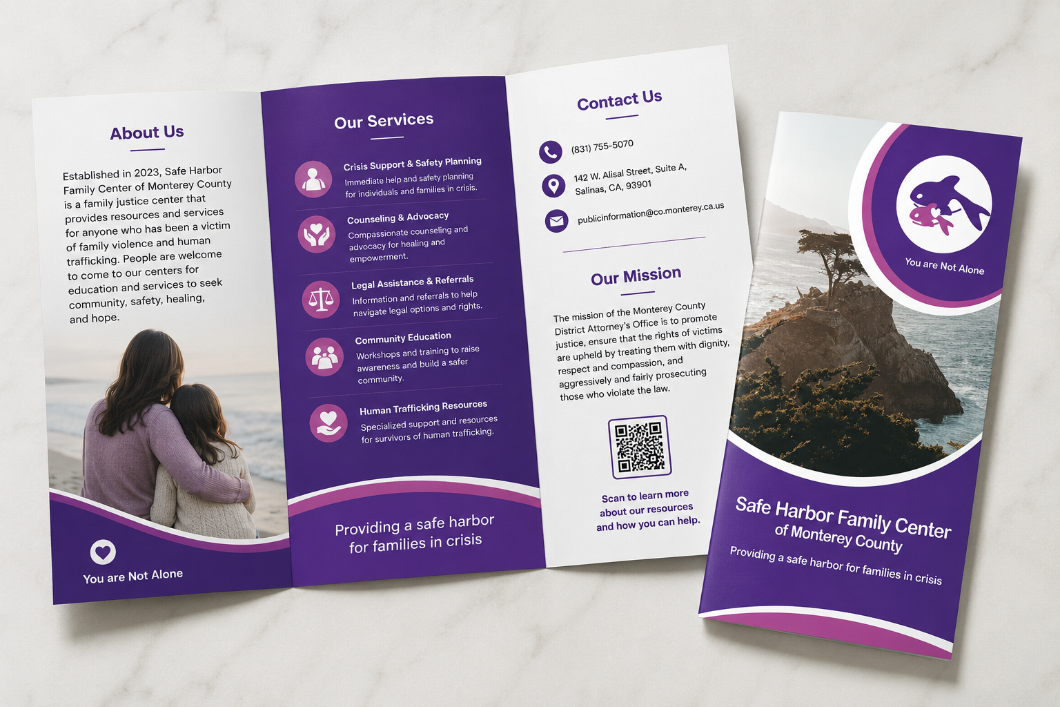
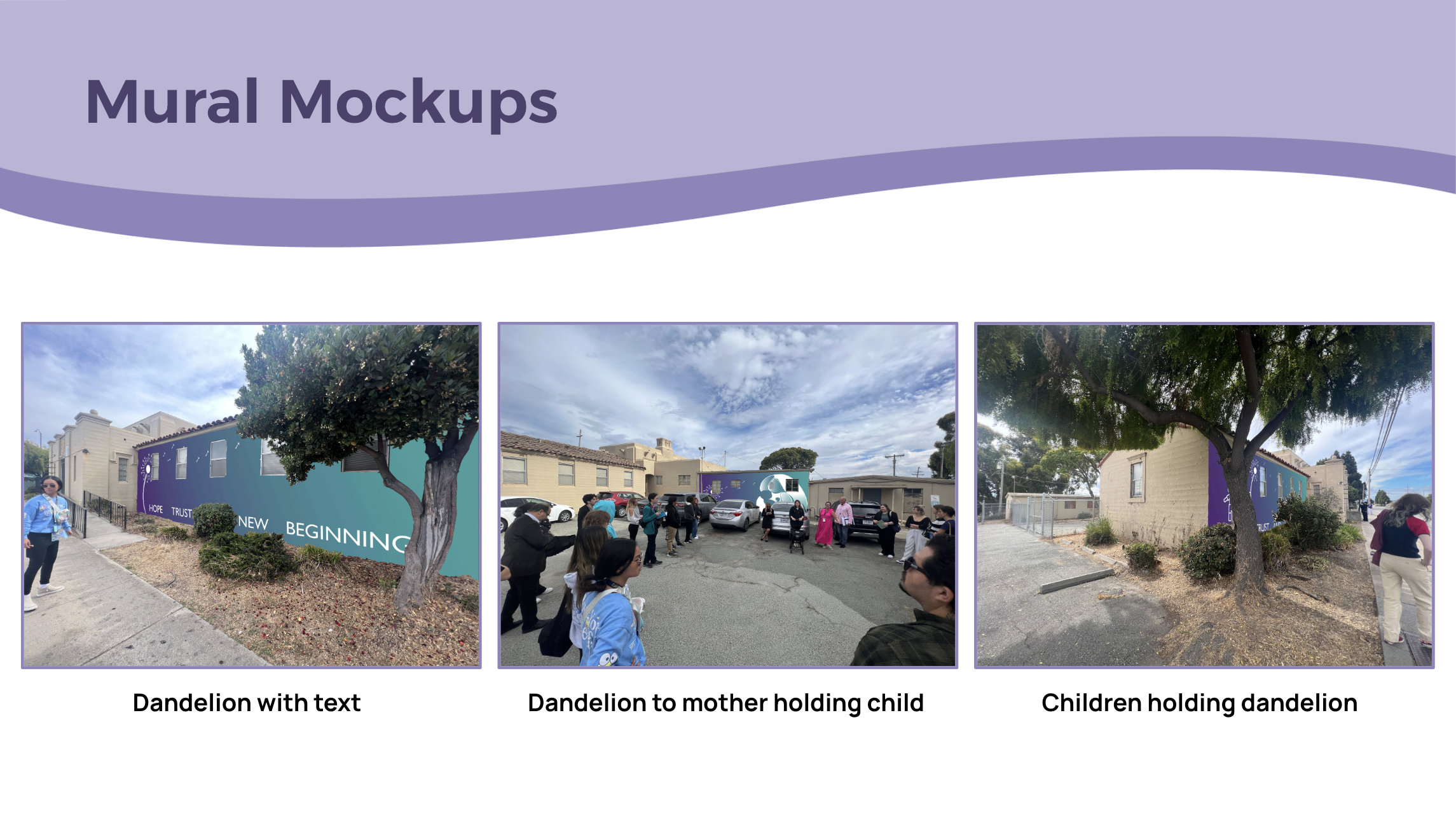
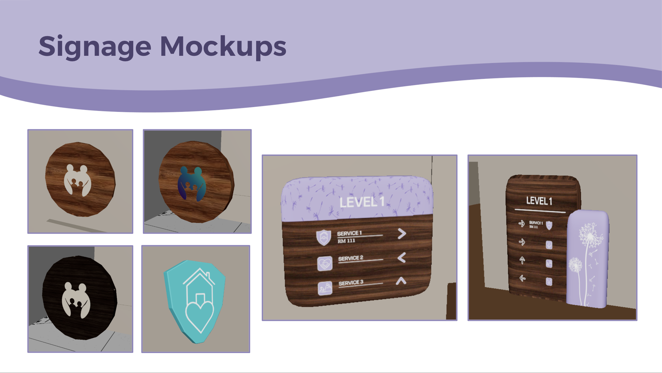
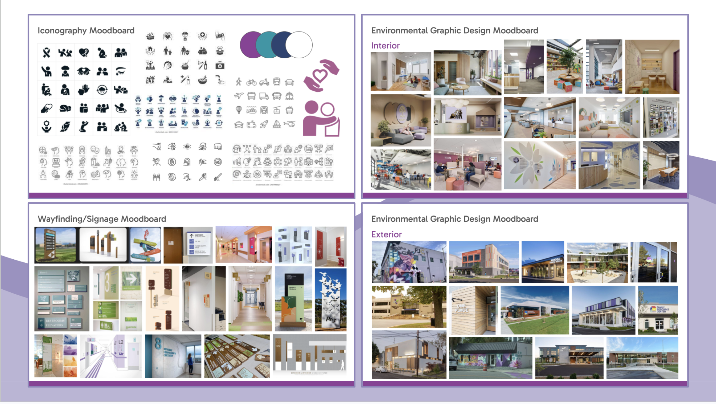
Holding onto Hope Family Justice Center | Interior Design
Overview
Developed interior design concepts for Holding onto Hope, using soft visuals, signage systems, and calming environmental graphics to support a welcoming family justice center experience.